Role
Full-stack minded engineer responsible for product flow, React implementation, state handling, test strategy, UI iteration, and planning future backend-backed features.
Full-stack ready React app / TDD / Playwright / product thinking
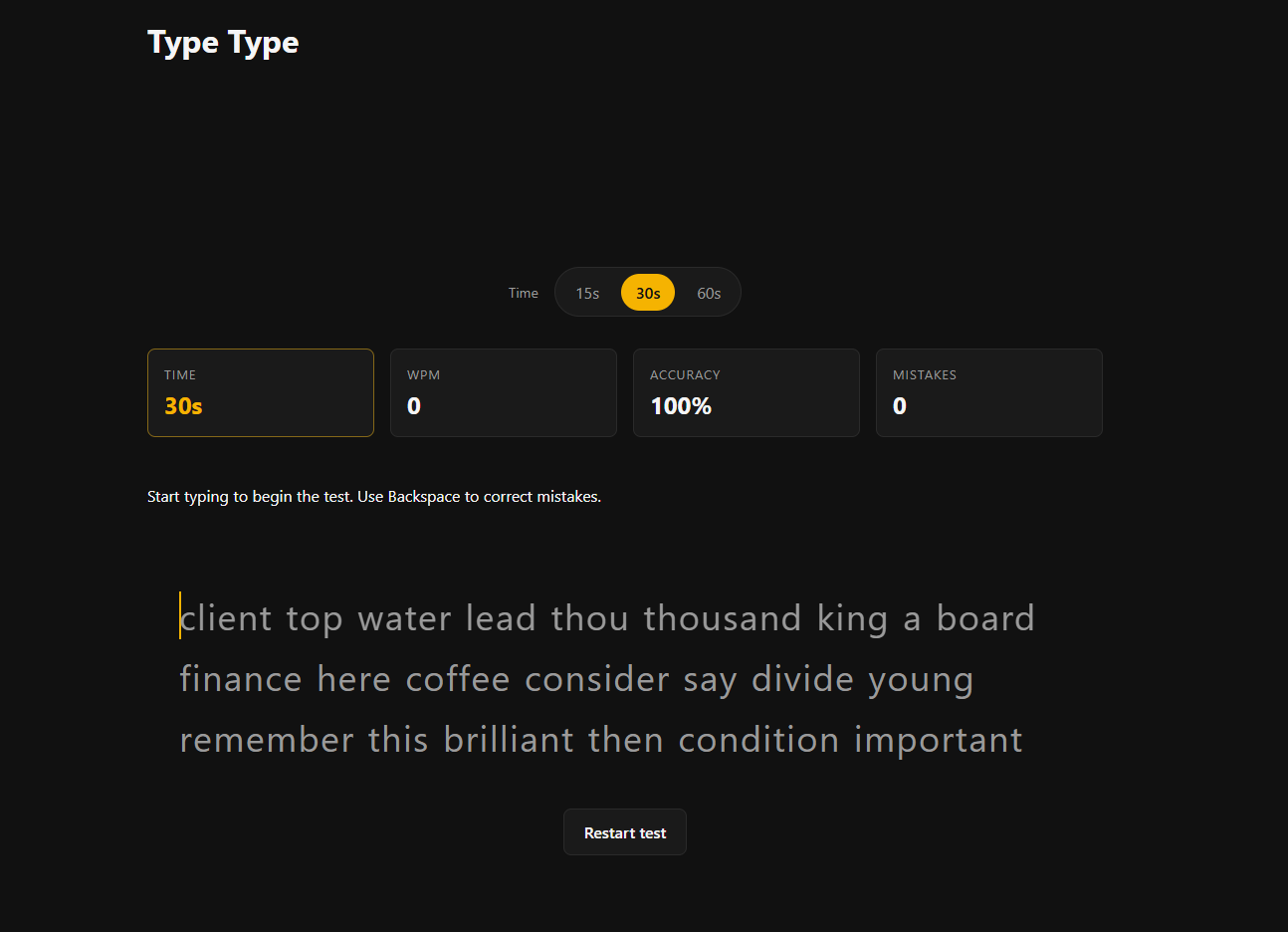
Type Type is a typing test platform designed to make typing practice feel fast, focused, and measurable. The project looks simple from the outside, but the core challenge was building an interaction-heavy app where every keystroke changes state, feedback, progress, and results.
I approached it as both a product and engineering exercise: define the smallest useful practice loop, protect the fragile behavior with tests, and structure the app so future features like multiplayer and richer statistics, accounts, and persisted progress can be added without rewriting the foundation.
Full-stack minded engineer responsible for product flow, React implementation, state handling, test strategy, UI iteration, and planning future backend-backed features.
React, JavaScript, TDD, Playwright, responsive UI patterns, and architecture planning for accounts, stats, and multiplayer sessions.
Help users practice typing with immediate feedback, clear progress, and a simple experience that does not distract from the test itself.
The main value is not a static page. It is the accuracy and feel of the typing loop.
The riskiest parts of the app were protected with TDD and end-to-end validation.
The foundation was kept simple enough to ship, but structured for richer stats and multiplayer later.
I wanted to build a project where the main value did not come from a static layout, but from the quality of the interaction. A typing test is a good challenge because the app has to respond instantly and correctly to every input. Small bugs are easy for users to feel: incorrect character highlighting, timer issues, result mismatches, or state that does not reset cleanly can break trust immediately.
That made Type Type a useful project for practicing product thinking, state design, testing discipline, and full-stack product decisions in one focused experience.
The product question was: how do we make a tiny interaction feel reliable enough that users can trust it over and over again?
Typing practice apps appear straightforward, but the core flow is state-heavy. The app needs to know what the user is typing, what text they are typing against, which character is active, which characters are correct or incorrect, when the test starts, when it ends, and what results should be shown.
The challenge was to keep that logic reliable while keeping the user interface minimal. I did not want users to think about the app. I wanted them to start typing, understand their mistakes, and finish with useful feedback.
Prompt text, current character, mistake feedback, and result.
Input, expected text, active index, accuracy, time, and status.
One incorrect state update can make the entire test feel broken.
User enters the test without extra setup.
Every keystroke updates progress and feedback.
The app compares typed input with expected characters.
User sees completion feedback and can try again.
The first screen needed to make the action obvious. The user should not need onboarding or explanation before starting a typing session.
The main interaction had to show progress and mistakes without visually overwhelming the user. Feedback needed to be visible but not noisy.
At the end of a test, the app should help the user understand how they performed and encourage another attempt.
I made product decisions by asking whether each idea helped the user type, understand feedback, or improve over repeated attempts. Anything outside that loop was treated as secondary.
Why
I avoided adding too many controls or decorative elements because the typing area is the product. The UI should support the practice session, not compete with it.
Impact
Users can understand the task immediately and stay in flow.
Why
Users need to know whether they are on track while typing. Live character feedback is more useful than waiting until the end to show errors.
Impact
Mistakes become easier to notice and correct during practice.
Why
Typing practice is repetitive by nature, so resetting the test, starting again, and understanding the result state needed to feel smooth.
Impact
The product feels like a practice tool, not a one-time demo.
I treated the typing experience as a small state machine. Instead of thinking only in terms of screens, I thought through the states the app can be in: waiting to start, actively typing, showing mistakes, completing the test, and resetting for another round.
This helped make the logic easier to reason about. When the user types a character, the app has to compare it against the expected character, update progress, update feedback, and decide whether the test is complete. Separating those decisions from the visual rendering made the app easier to test and change.
Keyboard events and typed characters
Comparison, active index, accuracy, completion
Current progress, mistake status, test lifecycle
Prompt display, feedback, progress, result state
Unit behavior, component behavior, end-to-end flow
A useful way to think about the app was as a session with clear states. This made the behavior easier to reason about and helped define what should be tested.
Prompt is visible, input is empty, and the timer has not started.
User is typing, feedback updates, and progress is tracked.
The prompt is finished and the app shows the result state.
Input and result state are cleared so the user can try again.
I used test-driven development because the highest-risk part of the project was not how the UI looked. It was whether the interaction behaved correctly across many small input changes.
The TDD approach also helped me slow down at the right moment. Before writing UI code, I had to define what correct behavior actually meant: what should happen after a correct key, an incorrect key, a completed prompt, or a reset. That made the implementation more intentional.
The testing strategy followed the same shape as the product risk. The closer something was to the typing interaction, the more important it was to verify.
Core typing behavior was treated as logic that should be tested directly: character matching, progress, completion, and reset behavior.
UI behavior needed to reflect the underlying state clearly. The component layer was tested around what users can see and do.
Playwright was used to validate the complete flow like a real user: open the app, type through a test, and reach the expected result.
I focused test coverage on behavior that would immediately affect trust in the product if it broke.
For this type of app, end-to-end tests are valuable because the main risk is the full interaction, not one isolated function. Playwright helped verify that keyboard input, DOM updates, visual states, and test completion worked together.
This gave me confidence that the app still worked after UI changes, styling changes, or refactors to the typing logic.
Because typing apps react to rapid input, edge cases can appear very quickly. I considered these scenarios while shaping the logic and test coverage.
Visually, I wanted the page to feel direct and low-friction. The design should support concentration: clear text, obvious feedback, and enough whitespace to make the typing area feel calm.
The biggest tradeoff was choosing depth over breadth. It would have been easy to add more visible features, but the project was stronger when the core interaction was treated as the main feature.
I kept the first version focused on the core typing experience instead of adding many modes immediately. This made the foundation easier to validate.
Rather than trying to test everything, I focused testing effort on the paths most likely to break the user experience: typing, feedback, completion, and reset.
Multiplayer was planned as a future direction, but I did not want to add it before the single-player typing loop felt solid.
Type Type reinforced that interactive product engineering is not only about components and styling. The quality of the experience depends on how well product flow, state design, testing, and future data needs work together.
It also showed the value of keeping a project small enough to finish but deep enough to exercise real engineering decisions.
Type Type shows how I approach full-stack product engineering beyond visual implementation. I think through the user loop, identify fragile behavior, model state clearly, test the parts that matter, and keep the interface ready for future backend-backed features.
It also reflects the kind of work I enjoy: product-minded full-stack development where interaction quality, maintainable code, data thinking, and user experience all matter at the same time.
The result is a working typing practice platform with a stronger engineering foundation than a simple demo. It shows how I approach an interaction-heavy product: understand the user loop, make deliberate product decisions, isolate risky logic, test important behavior, and keep the UI focused on the task.